The brief
Visidex needed an identity that would survive being shrunk. Operations and records tooling lives in browser tabs, favicons and email signatures — places where a detailed mark disappears and an accent colour turns to mud.
What we made
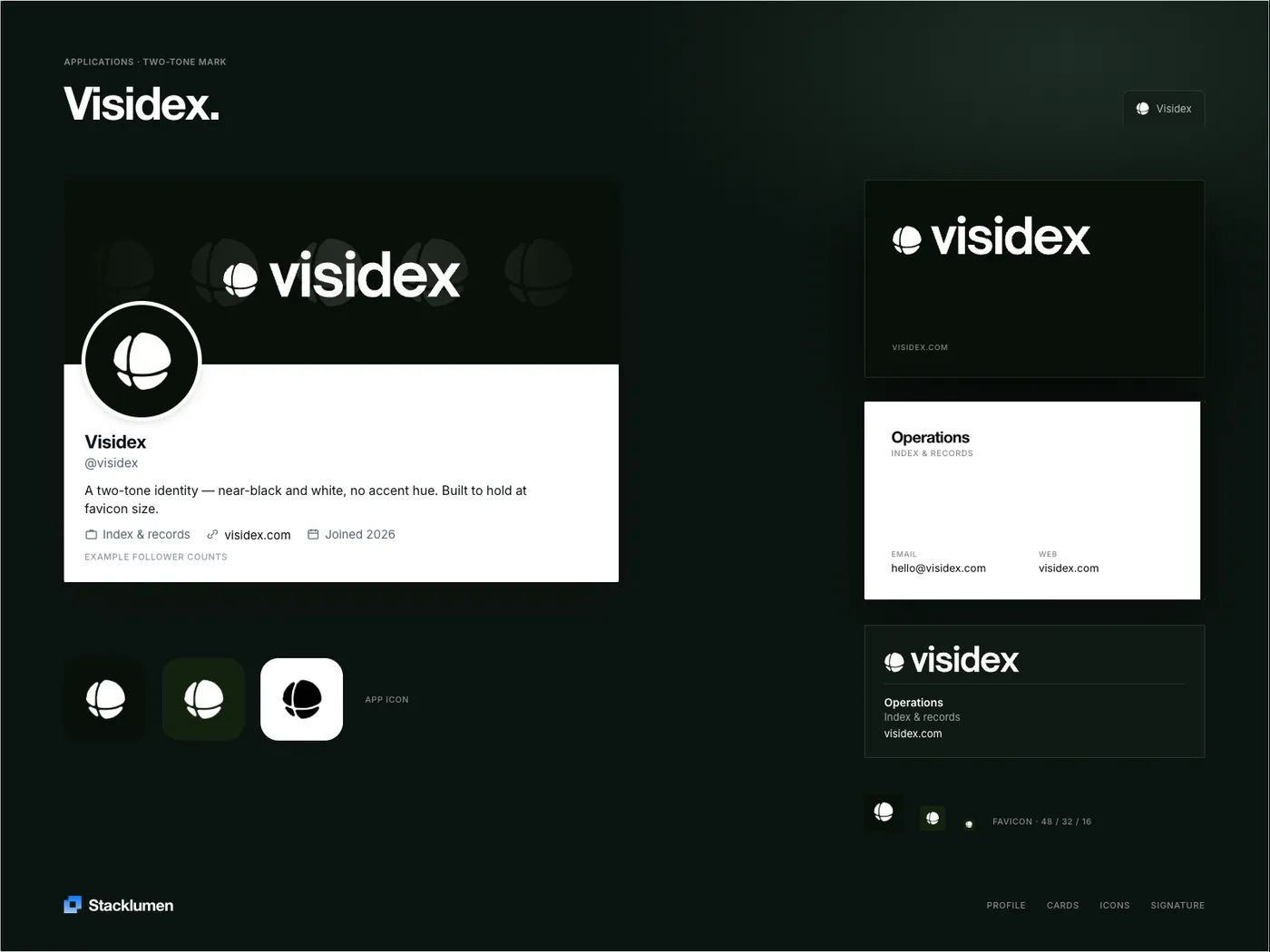
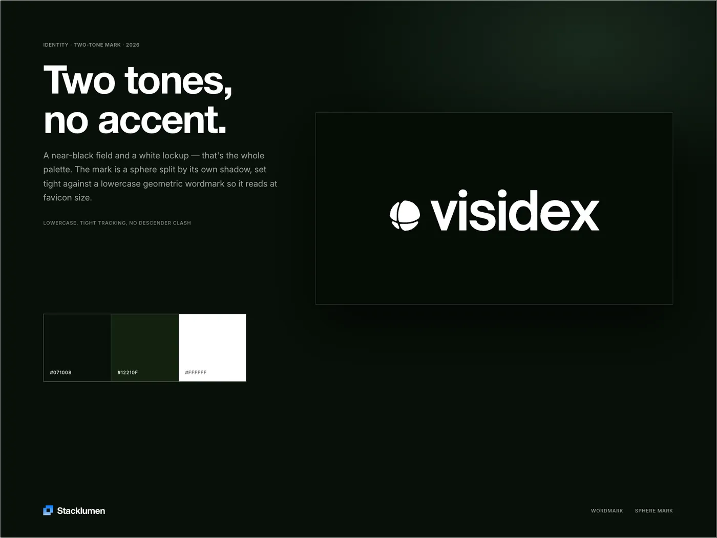
A two-tone system: a near-black field, a white lockup, and no accent hue at all. The mark is a sphere split by its own shadow, set tight against a lowercase geometric wordmark so the two read as a single shape at favicon size.
The palette is three values — #071008, #12210F and white — and every applied surface is drawn from that one lockup rather than redrawn per format, so the cards, the signature block and the app icon are recognisably the same object.
Deliverables
- Sphere mark, lowercase wordmark and lockup rules
- Three-value palette: #071008, #12210F, #FFFFFF
- App icon set and favicons at 48 / 32 / 16
- Business cards and email signature
- Profile and social header artwork
In application