The challenge
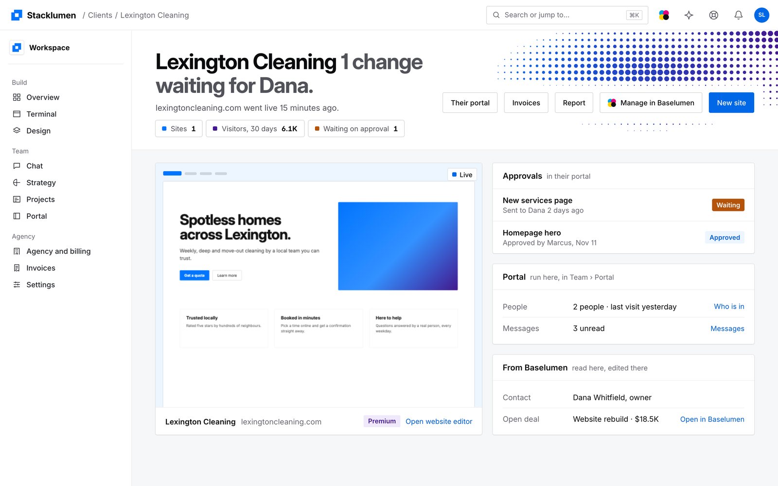
By October the app had grown one screen at a time: a spine rail beside a separate panel, grey plates to mark where you were, pill-shaped statuses and a gradient mark. Each area was right on its own, and together they read as several products. The marketing site's drawings of the app had drifted from the app itself.
The solution
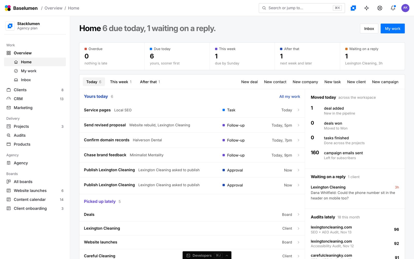
We redrew the whole workspace as one shell, from approved mockups. A calm 56px bar carries the crumb and search. One 244px sidebar holds the workspace, its Build, Team and Agency sections and every client with a colour marker. Every screen opens on a halftone head: a white band whose right side carries real dot screens graded from blue to purple, kept clear of the words.
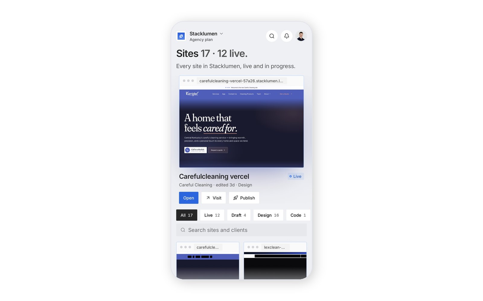
Statuses became a 6px ink square beside the word. Screens hand over with a soft cross-fade instead of a blank page. Appearance gained a Brand mode, where the halftone breathes in the sidebar and bar, and a choice of square or rounded frames. A site now has six tabs, from Overview to Settings, and its cards show a real picture of the site.
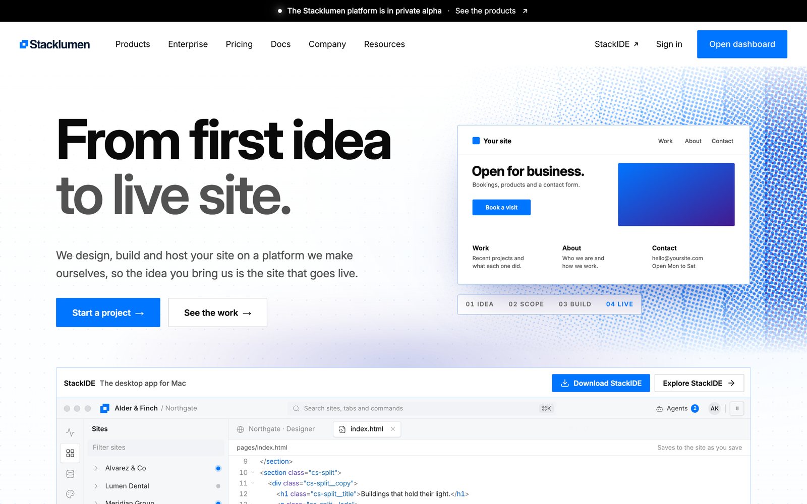
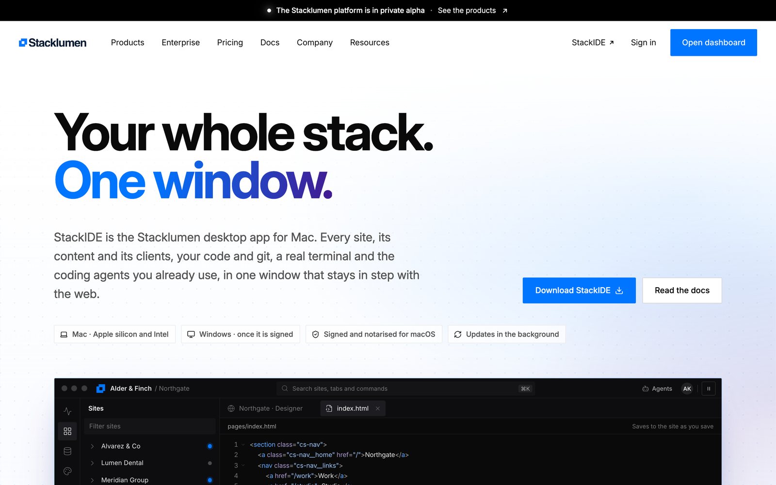
The marketing site moved with it: a solid #0075FF mark, two-line headlines whose second clause turns grey, and a homepage that draws a site from first idea to live page in halftone.
The results
The Next shell became the default on 8 November and the Classic shell was frozen. StackIDE and the phone app wear the same shell, so someone moving between the browser, the desktop and their phone sees one product.
Services rendered
Product design · Brand system · Design system · Application development · Marketing site · CMS architecture
Gallery