The challenge
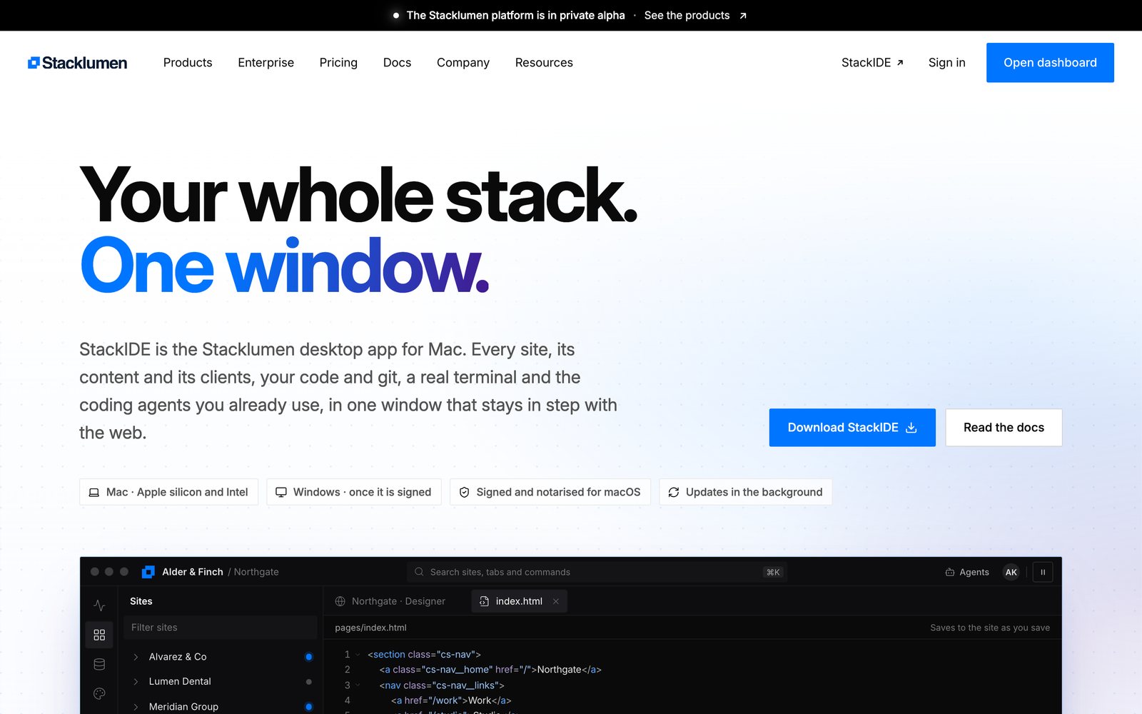
The first phone app had its own design: a floating tab bar, its own colours, and screens that said different things from the web. A person who knew Stacklumen in the browser had to learn it again on their phone.
The solution
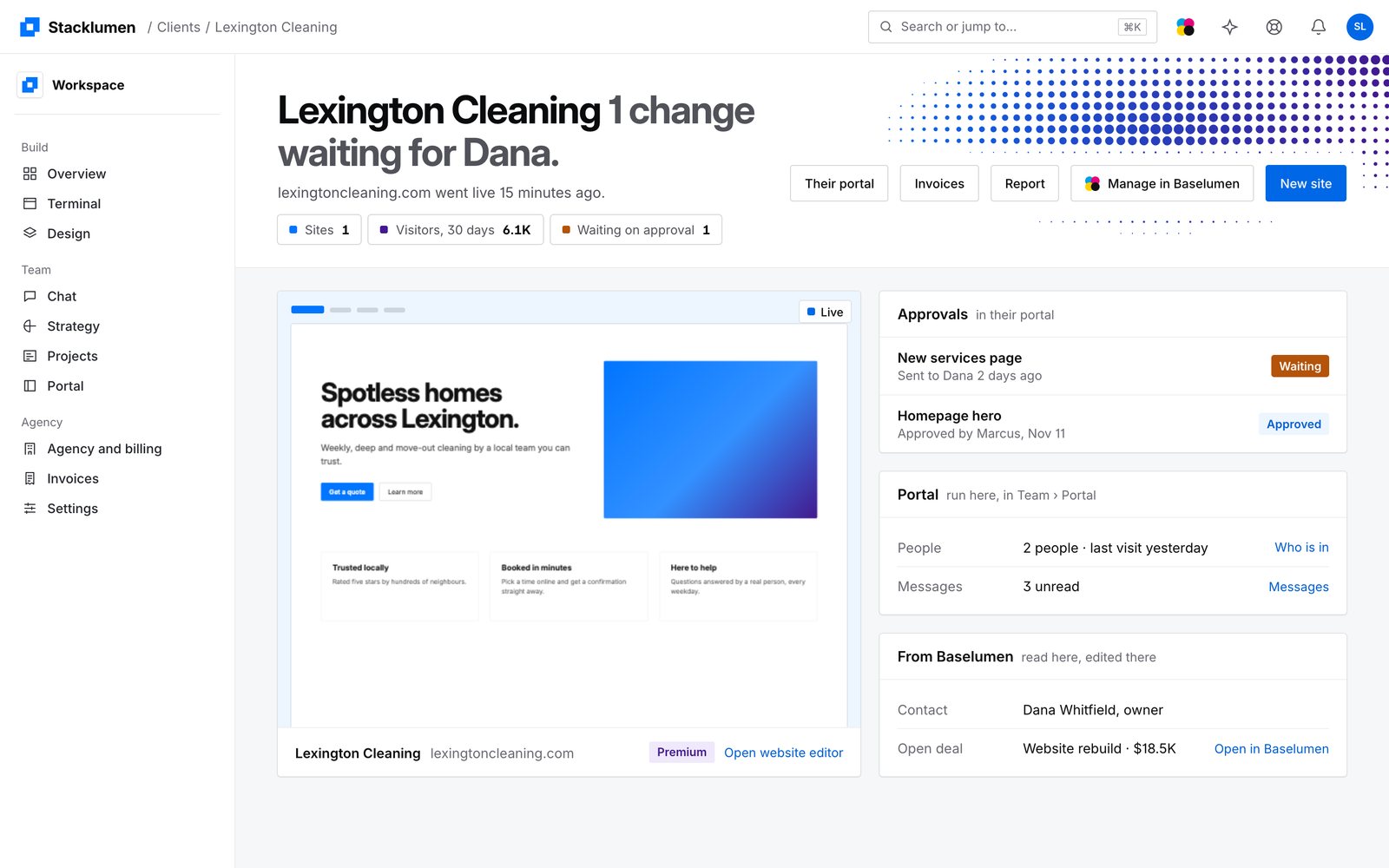
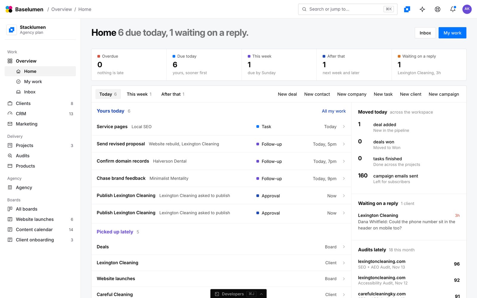
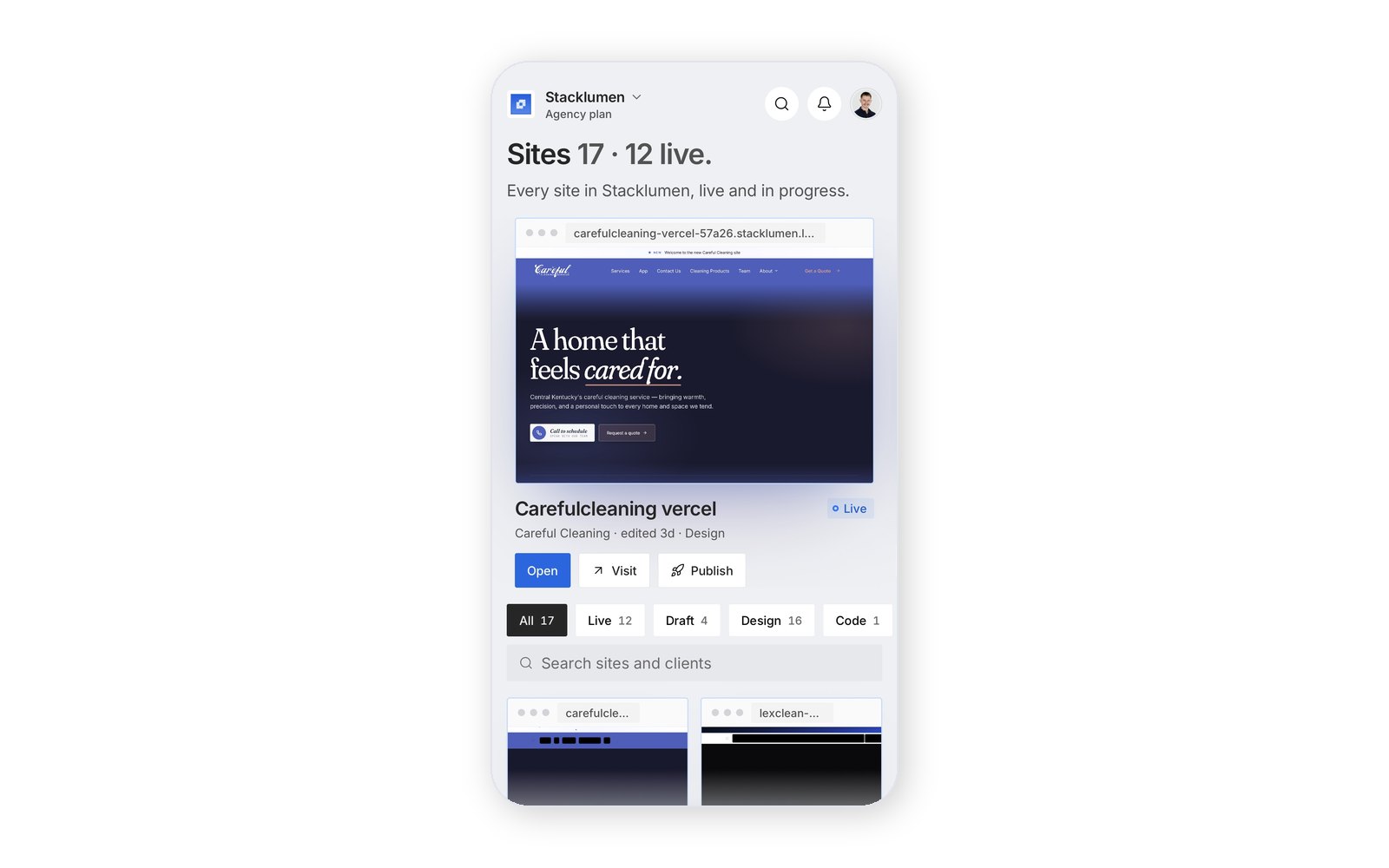
Version 1.1 put the phone on the Lumen Kit, the look the web and StackIDE wear. The platform's tab bar gave way to a dock of our own, one slim tray with a raised chip that slides to the section you are in. Overview, Clients and Sites are the web's screens on a phone, and Sites is a carousel of each site lit in its window as its visitors see it.
Every screen arrives the same way: blocks rise in turn 45ms apart, cards give under the thumb and figures tick when they change. A client who signs in gets a home of their own, in the same words their web portal uses.
The results
Version 1.1 shipped in November, and its point releases added the client space, Stacklumen Play and the developer center.
Services rendered
Product design · Motion design · Phone application · App Store release